Minivan Branding
Category
My creative brief was to create a branding package for an invented automotive company producing affordable minivans. The company’s focus was on form over function, aiming to appeal to a male audience by balancing excitement with a grounded, everyday practicality. The challenge lay in crafting a complete brand identity that felt bold, confident, and stylish, yet still accessible.
Concept
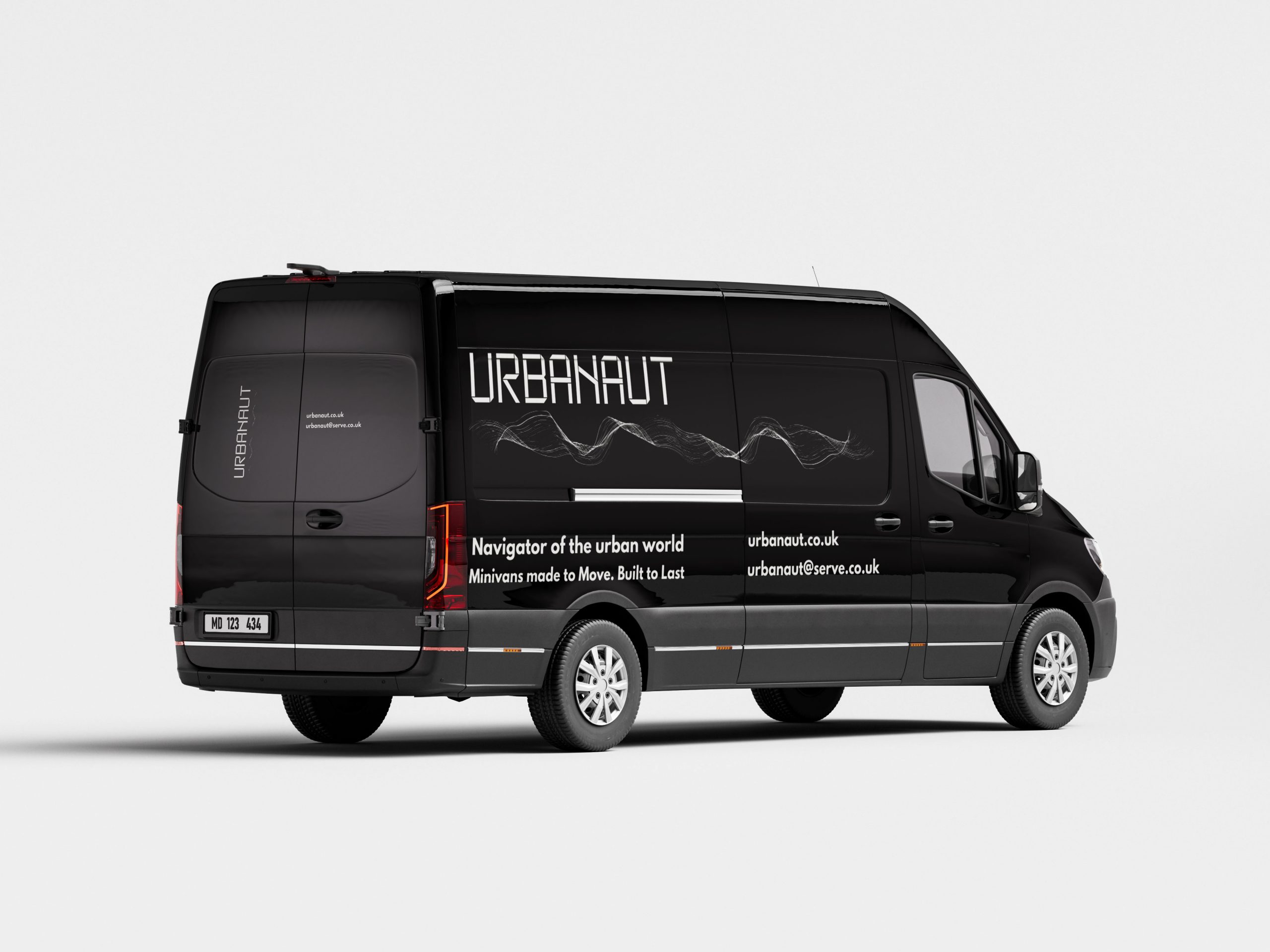
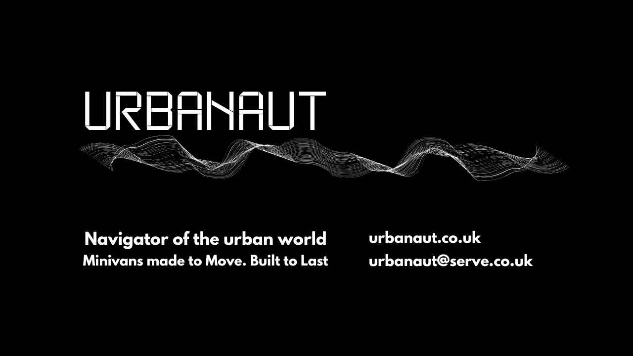
The design concept centred around a masculine, modern aesthetic that celebrated design as a statement of identity. Drawing inspiration from industrial forms, aerodynamic structure, and urban exploration, the proposed brand name URBANAUT emerged, meaning “navigator of the urban world.” The concept positioned the company as a creator of vehicles that combine sleek design with everyday usability, appealing to those who value presence and style as much as performance.
The visual direction emphasised bold geometry and minimalism, using matte textures, clean lines, and a muted industrial palette. Charcoal, graphite, and steel blues were paired with an accent of deep red to convey controlled energy and modern sophistication.
Execution
The logo design explored a minimalist monogram, symbolising strength and structure. Typography was chosen to reinforce the brand’s personality: bold, paired with clear, legible body text for approachability.
Applications of the identity system extended across vehicle livery, stationery, digital platforms, and advertising mock-ups, all unified through consistent use of colour, proportion, and tone.
Outcome
The URBANAUT branding successfully merges urban sophistication with everyday reliability. The overall identity communicates strength, purpose, and style, embodying a sense of motion and confidence without pretension. It establishes a cohesive, recognisable visual system that resonates with its target audience, presence, and authenticity in design.