Travel Posters — Promotional Campaign Design
Category
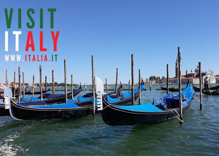
I designed a series of promotional travel posters aimed at encouraging tourism and travel awareness. Each poster was created to reflect the unique character and visual identity of different destinations, including Italy, British Columbia (Canada), and a Post Office travel campaign for currency services. The goal was to create bold, eye-catching designs that could be used across print and digital platforms to inspire travel and inform audiences.
Concept
The concept focused on pairing striking travel photography with clean, impactful typography and strong national branding elements. Each design utilised colours, symbols, and type styles associated with the respective location to create a sense of place — such as Italy’s green, white, and red palette, or the maple leaf emblem for Canada. The imagery captured iconic travel moments, from gondolas in Venice to scenic chairlifts in the mountains, to instantly evoke wanderlust.
Execution
I created a cohesive set of posters using clear typographic hierarchy and simple, structured layouts to ensure that destination names and key information were easy to read at a glance. Each visual was optimised for both print and digital use, maintaining high image quality and clear messaging. The designs balanced photography with graphic elements, creating posters that were both promotional and visually immersive.
Outcome
The final posters successfully showcased each travel destination in a way that was both aspirational and informative. Their clean design and vibrant imagery made them suitable for use in marketing campaigns, travel agencies, and social media promotion, effectively drawing attention and inspiring viewers to explore new places.